本文最后更新于399 天前,其中的信息可能已经过时,如有错误请发送邮件到1986413837@qq.com
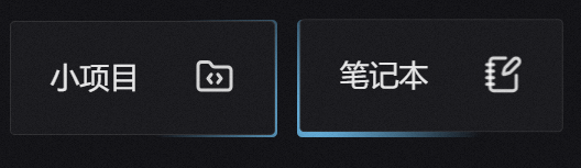
在重庆大学27届前端佬的个人博客中发现了 这样的效果 鼠标凑近盒子时 边框变亮 觉得很有意思 于是思考如何实现?
想不出来 就去找了教程 没想到真有 不过就一家 但够用了
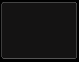
思路大体是这样: 三层盒子
第一层是容器盒子 设置白色透明色 第三层是innner盒子 设为绝对定位后 加上inset : 2px 相当于边框效果实际上是由两个大小差不多的盒子显现出来的 不是真的边框 效果就像这个样
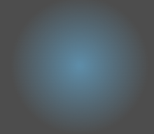
第二层盒子是第一层盒子的伪元素盒子 设置背景色为径向渐变 由你喜欢的颜色 —> 透明色 就像这样
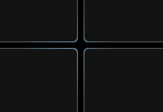
现在就要监控鼠标移动事件 设置第二层盒子的位置 因为会有多个盒子 所以需要的是鼠标和每个盒子的相对位置 通过JS和CSS变量实现 ( 这一块之前真不太了解 尤其是CSS变量)
给第二层盒子设置 CSS变量
left: var(--x, -1000px);
top: var(--y, -1000px);
JS获取相对位置 使用item.style.setProperty (JavaScript 提供的 动态修改 CSS 样式 的方法) 设置第二层盒子的相对位置
最终实现效果
代码如下
<!DOCTYPE html>
<html lang="en">

<head>
    <meta charset="UTF-8">
    <meta
        name="viewport"
        content="width=device-width, initial-scale=1.0"
    >
    <title>Document</title>
    <style>
        body,
        html {
            width: 100%;
            height: 100%;
            background-color: #000;

        }

        .wrapper {
            margin: 10px;
            width: 5000px;
            height: 5000px;
            display: grid;

            grid-template-columns: repeat(3, 240px);

            grid-gap: 10px;

            grid-template-rows: 180px 180px;
        }

        /*第一层*/
        .item {
            background-color: rgba(255, 255, 255, 0.3);
            display: flex;
            align-items: center;
            justify-content: center;
            font-size: 24px;
            border-radius: 8px;
            position: relative;
            overflow: hidden;
        }

        /*第二层*/
        .item::after {
            content: '';
            position: absolute;
            width: 100%;
            height: 100%;
            border-radius: inherit;
            z-index: 2;
            left: var(--x, -1000px);
            top: var(--y, -1000px);
            transform: translateX(-50%) translateY(-50%);
            background: radial-gradient(closest-side circle at center,
                    rgba(105, 184, 230, 0.6) 0%,
                    rgba(255, 255, 255, 0) 100%);
        }

        /*第三层*/
        .inner {
            position: absolute;
            border-radius: inherit;
            inset: 2px;
            z-index: 3;
            background-color: #141313;
        }
    </style>
</head>

<body>
    <div class="wrapper">
        <div class="item">
            <div class="inner"></div>
        </div>
        <div class="item">
            <div class="inner"></div>
        </div>
        <div class="item">
            <div class="inner"></div>
        </div>
        <div class="item">
            <div class="inner"></div>
        </div>
        <div class="item">
            <div class="inner"></div>
        </div>
        <div class="item">
            <div class="inner"></div>
        </div>
    </div>

    <script>
        const wrapper = document.querySelector('.wrapper');
        const items = document.querySelectorAll('.item');

        wrapper.addEventListener('mousemove', function (e) {
            for (const item of items) {
                const rect = item.getBoundingClientRect();
                const x = e.clientX - rect.left;
                const y = e.clientY - rect.top;
                item.style.setProperty('--x', `${x}px`);
                item.style.setProperty('--y', `${y}px`);
            }
        });
    </script>
</body>

</html>